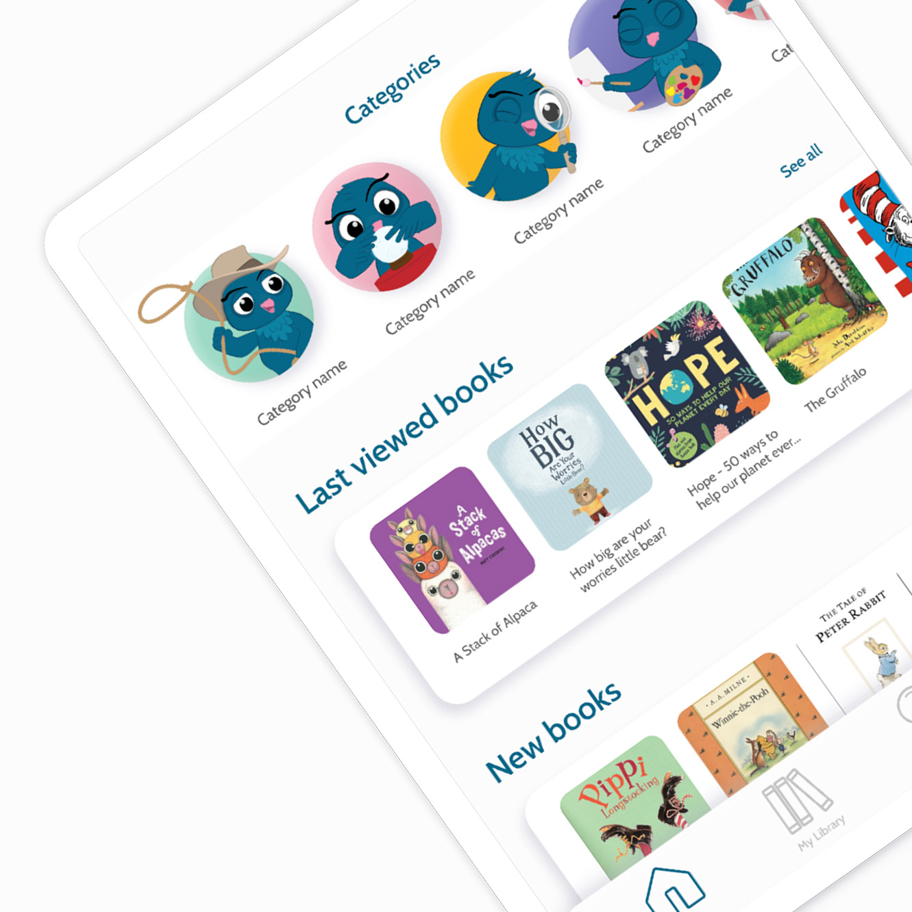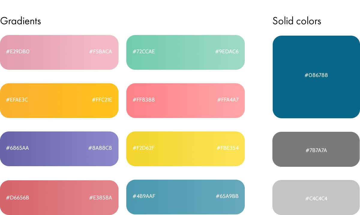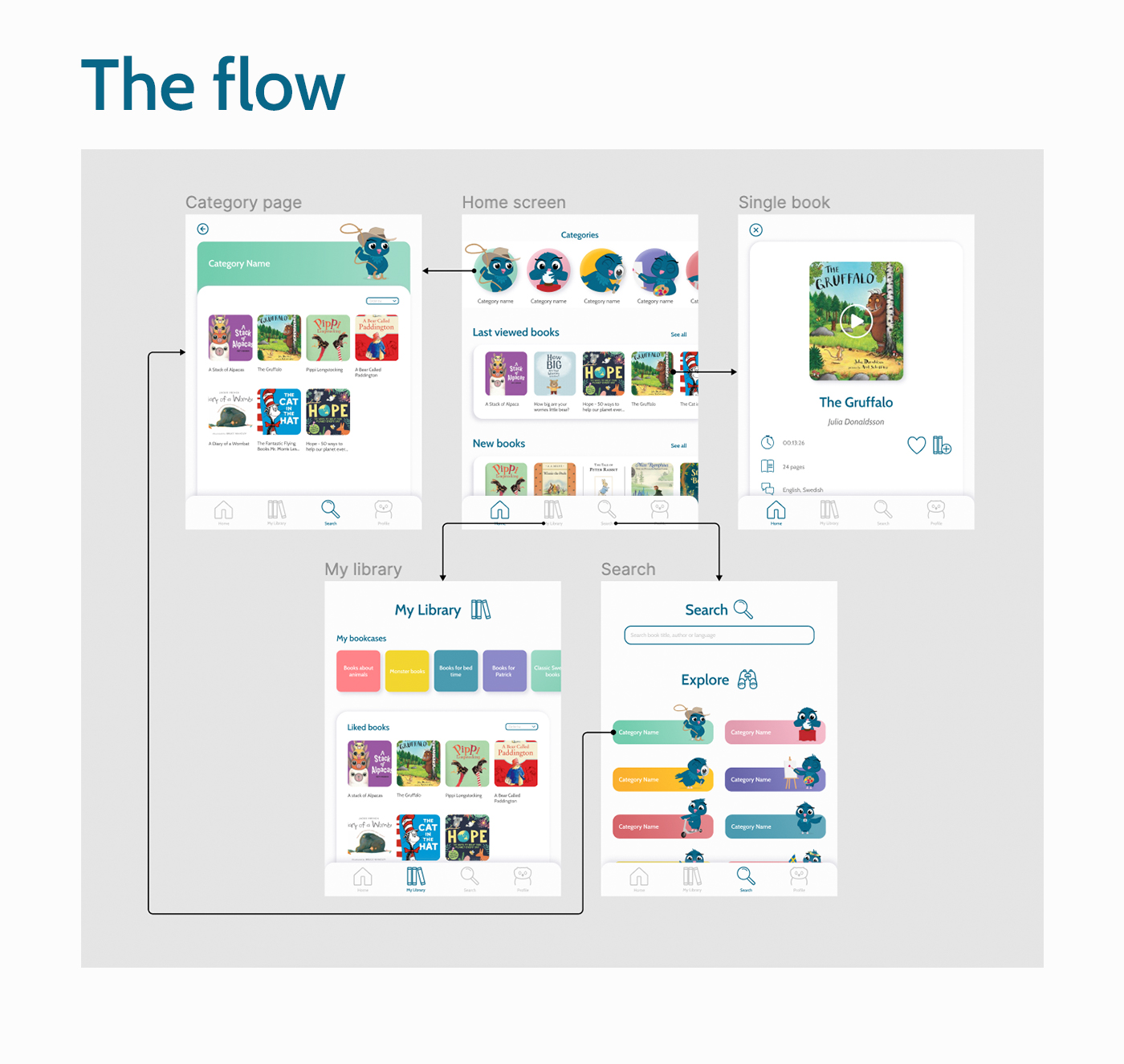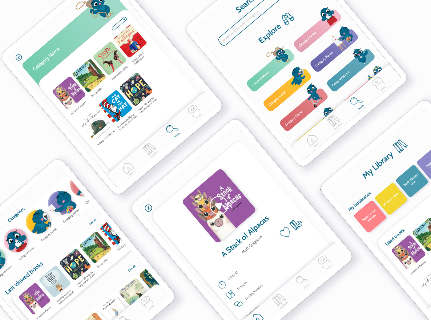
This project is a redesign of the Ugglo application. It is a personal solution based on the research I made during my internship at Ugglo Utbildning AB. The current application has problems with navigation. The users have a hard time finding what they are looking for. The app has an opening page with numerous groupings of books to scroll through. The category page is hidden behind an icon that users have a hard time understanding. Functions like “Liked books” and “Add book to bookcase” are hidden behind a settings icon.
Personal project based on research for Ugglo Utbildning AB
Creator
2019

Ugglo is children books streaming service in the form of application. It was created with the mission to encourage children to read. The service combines both audio and picture books that enchants children for further reading.
The primary user groups are younger children in elementary schools and pre-schools, and teachers.


The current icons used in the application do not share the same visual style, some are round while others are sharp. In some cases, the icons do not represent their functionality which makes the navigation confusing. With a new structure of the content and new features, new icons needed to be designed.

